Mind
Ideal Frame Co. Logo Process:
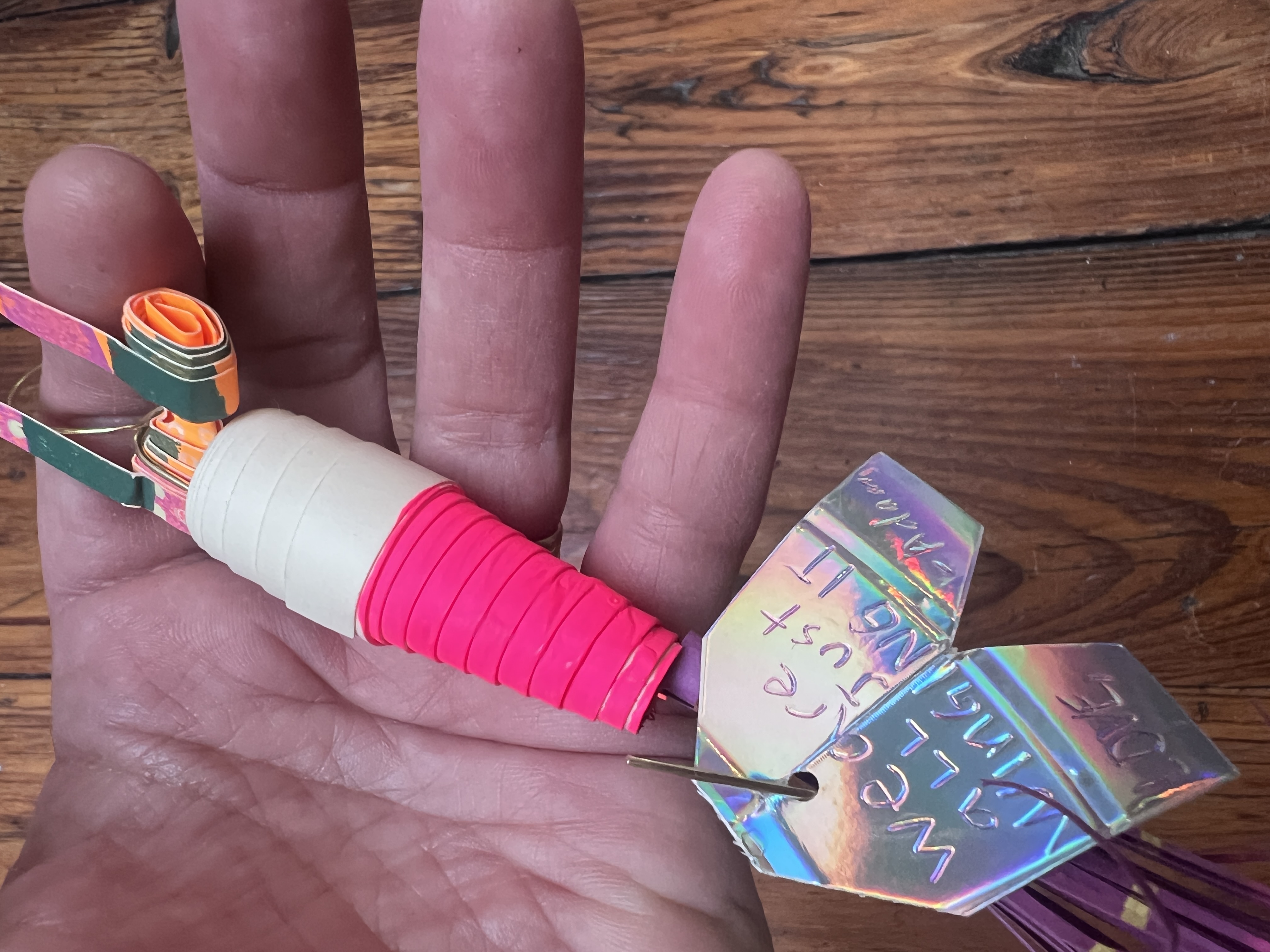
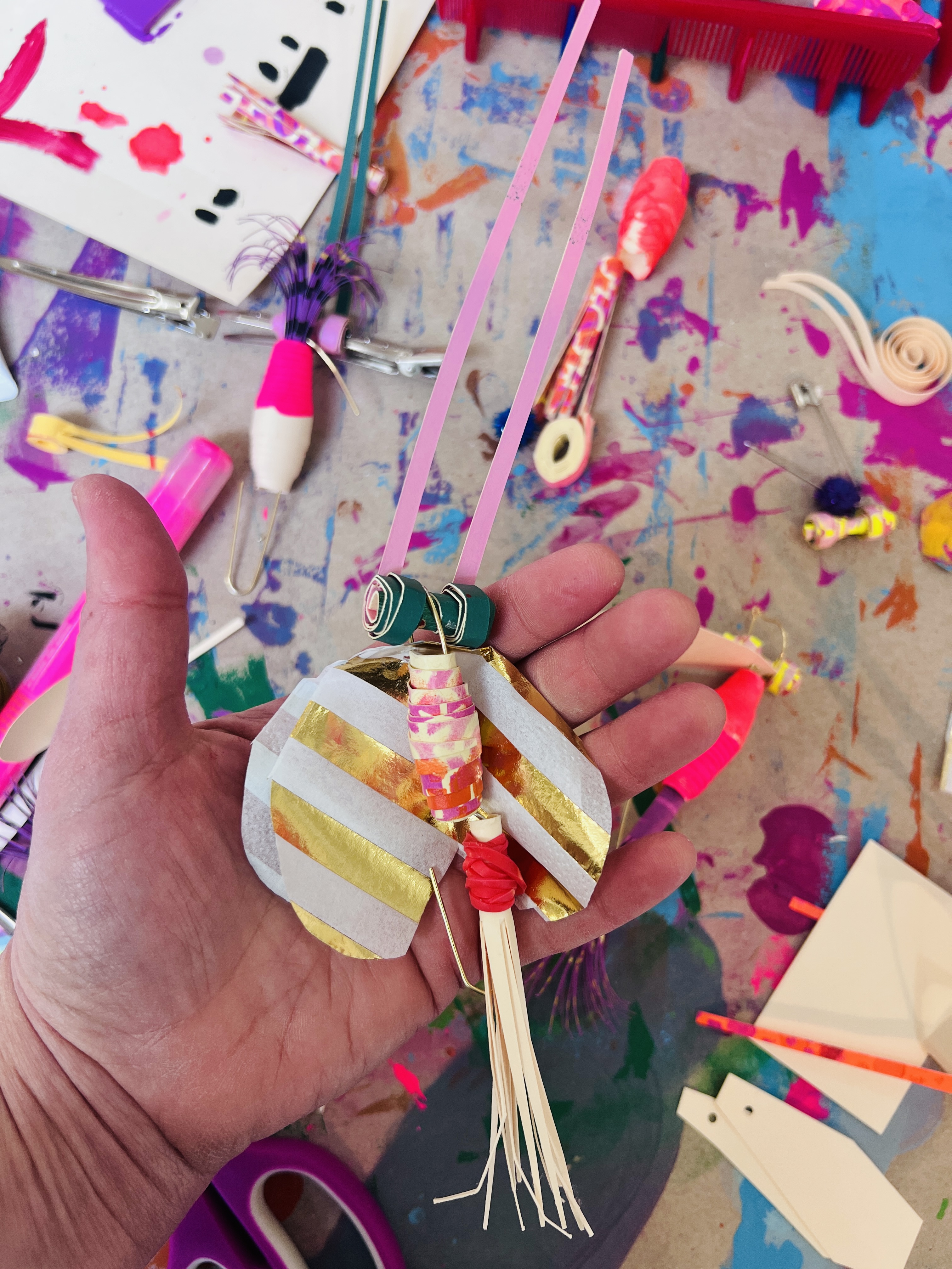
Assemblage art logo
Client Bio
Ideal Frame Co. makes all the wooden parts for furniture in Taylorsville, NC. Their clients include Mitchell Gold + Bob Williams and many more. North Carolina is famous for furniture production and it is so cool to be supporting - made in the USA manufacturing. They have been in business since 1956, and the new owner Bob Coley, wanted to do something totally artistic for his new logo. He found out about me from Darren Green and the Old Wood Co. logo of a rooster I created years ago. This design is pretty different as a woodpecker, but expresses what Ideal Frame Co does amazingly well, carving a whole lot of wood into frames for furniture manufacturers.
tap to explore


Process
I created the woodpecker logo inspired by folk art and "assemblage art” but with digital objects. Assemblage Art is made by assembling recycled objects often scavenged by the artist and sometimes bought specially and making something new. My salvaged objects were clipart from my Scan This Book by John Mendenhall collection (I have the whole series). The pages of those books gave me all the elements. I have this super cool lamp that lets me mount my iPhone and take photos book pages I needed. It’s called a Canvas Lamp. I set my phone to “mono", grayscale mode which saves me time when I clean the images up in photoshop.
First I had to find all the graphics I wanted to create the woodpecker, then create a digital collage the bird and then make it function as a logo. That means converting everything to vector art, and cleaning up the design. I do this by combining all the vector elements using the blob tool in Adobe Illustrator and then cleaning up the points using as few anchor points as possible. Its actually pretty tedious. I think this attention to detail is what makes the logo special, so I always try to be a minimal as possible from a technical stand point even with a complex graphic like this.
I chose a more modern font tt drugs by the Russian font designer Ivan Gladkikh. I love all the detail the font has and I think it gives it the edge we needed so it doesn't look retro even though it totally might of turned out that way.
There are different styles of logos. I’d call this design an illustrated assemblage art logo, full of unique texture and vintage vibes and artistic flair. I also pride myself on digital detail and went the extra mile with my technical and functionality a master of Adobe illustrator. These logo files will print beautifully at all sizes and in all digital mediums. The client received 5 iterations of the logo in the logo package (like a seal, horizontal version, and a square version).